Hawala

Fintech Brand Identity 
& App Design for MENA Remittance

Background

We partnered with Hawala to close the gap between what their product delivers and how it looks delivering it. Hawala is the fastest way to send money across the Middle East and North Africa – zero transfer fees, no hidden costs. The product promise was solid, but the visual identity wasn’t carrying its weight.

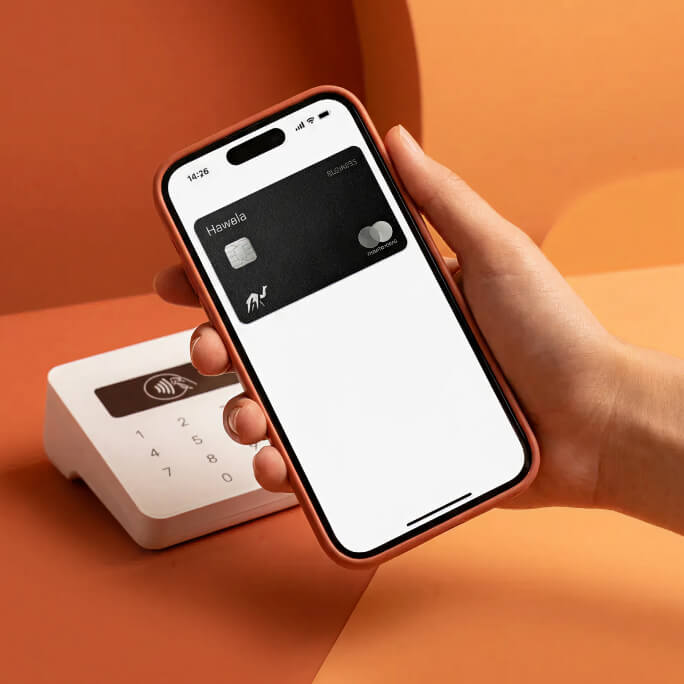
Our goal was to build a brand that communicates speed, security, and trust before a user reads a single word. We defined the color system, the typography hierarchy, and the illustration language, then applied the new direction across key app and web screens, giving the team a documented brand system they can own and scale independently.
Background

Brand Strategy

Visual Design

Illustration Language

Design

Color System

Typography

Custom Illustrations

App & Web Design

Deliverables

Brand Guidelines

illustrations Visual Direction

App & Web Design + Design System

Fintech Brand Identity & Visual System

We defined a visual language built for the MENA fintech space – a color system anchored in trust and motion, a typography hierarchy optimized for mobile readability, and a custom illustration style that is distinctly Hawala. Human, borderless, culturally legible.

App & Web UI Design

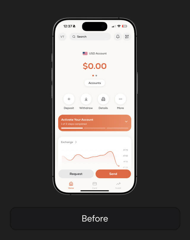
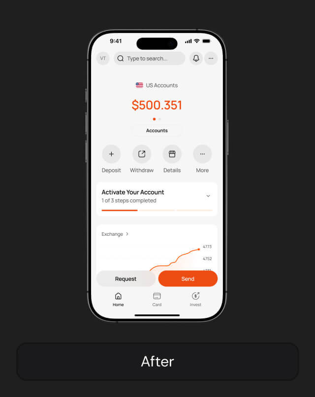
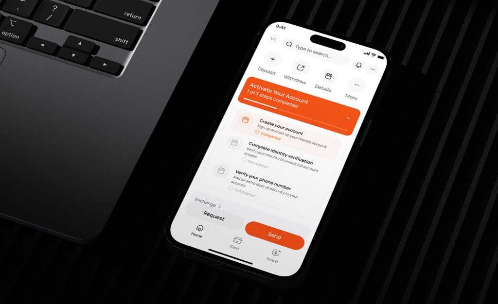
New brand direction applied to 2 key app screens and 1 web screen. Colors corrected, spacing tightened, hierarchy clarified. Before and after speaks for itself.

Results

Hawala went from a strong product to a brand that earns trust on first contact. The new visual identity is consistent across app, web, and marketing. The team has a documented system they can execute without an agency in the loop for every asset – and a brand that now converts attention into confidence before a single tap.

App Downloads in next 5 months

50K

Avg. App rating

4.7

[woocommerce_my_account]