Red Cottage

Brand Identity & Email Design System for Vacation Rentals

Background

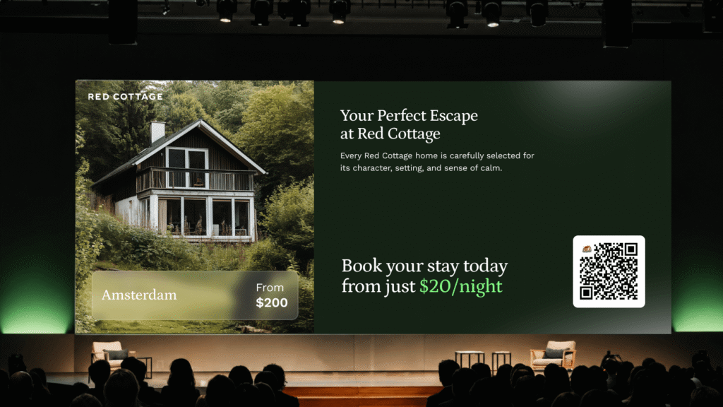
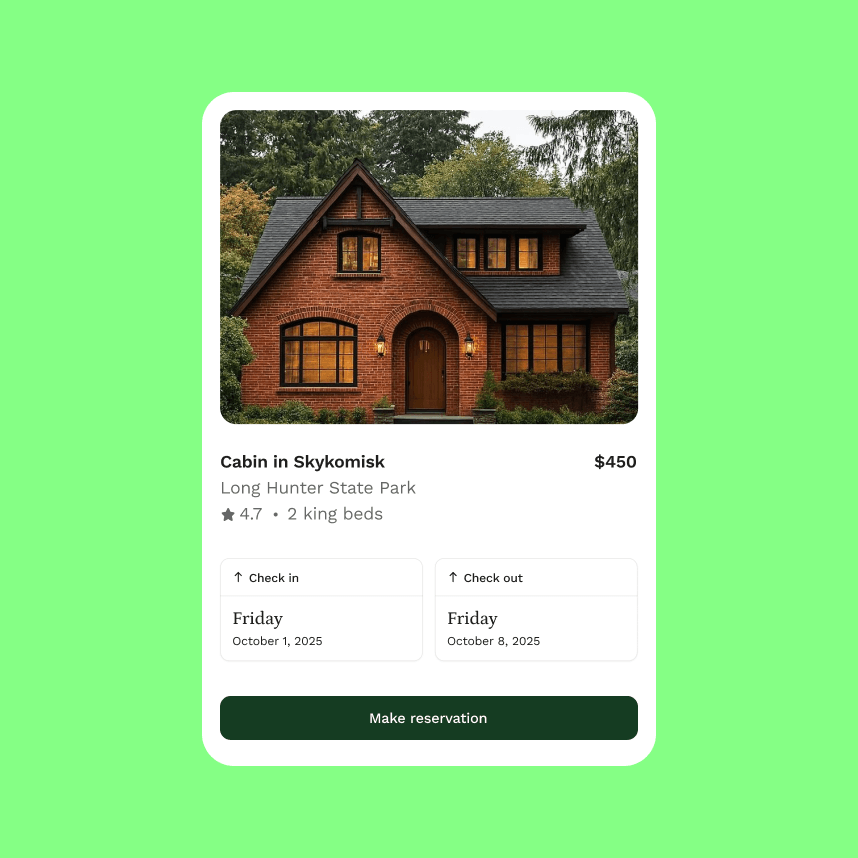
We partnered with Red Cottage to build a brand identity and email design system for a vacation rental company offering premium properties across the Northeast. The brand needed a visual language that matched the quality of the homes it represents – warm, refined, and instantly recognizable in a crowded inbox.
We developed the full visual identity from the ground up, including custom illustrations, typography, color palette, and a new logo, then applied it across a scalable email design system that the team can use to run campaigns independently.

Background

Brand Strategy

Visual Design

Illustration Language

Design

Color System

Typography

Custom Illustrations

Email Design System
Deliverables

Brand Guidelines

Custom Illustrations
Email Templates & Design System

Brand Identity & Visual Language

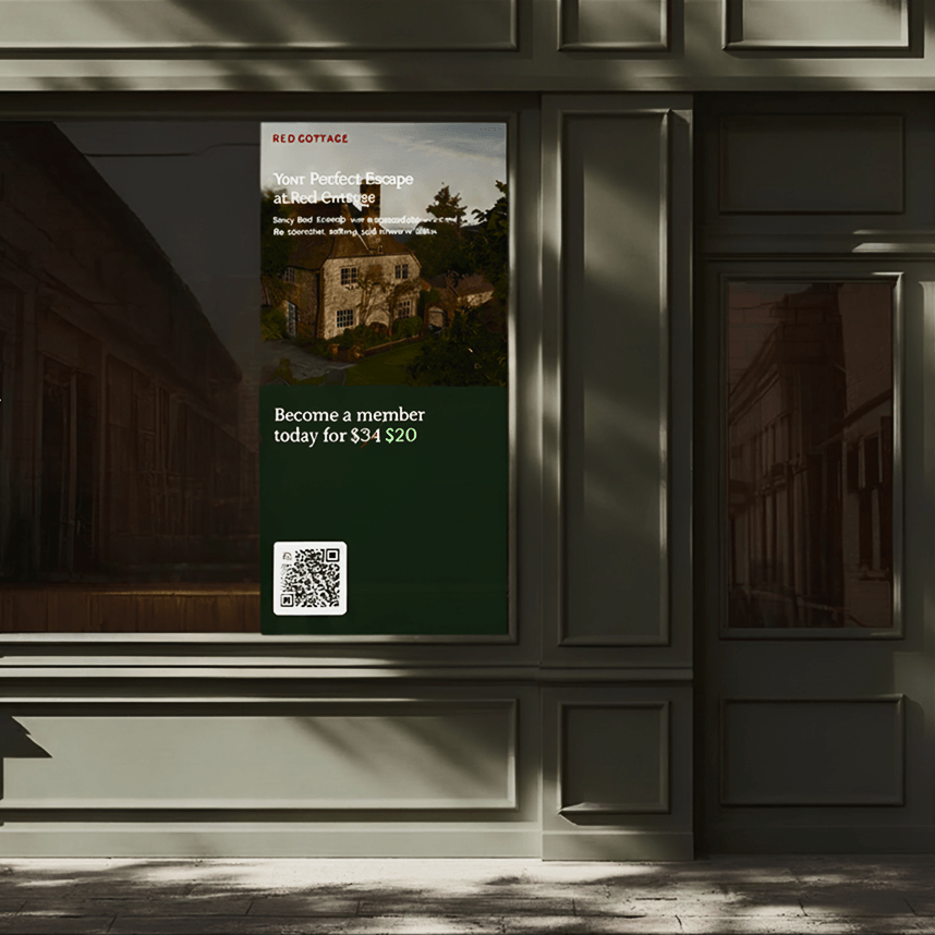
We defined the visual identity to position Red Cottage where it belongs – above the noise of generic rental listings. A color palette built around warmth and trust, a typography system that reads as premium without being stiff, and a set of custom illustrations that give the brand a personality no stock asset could deliver.

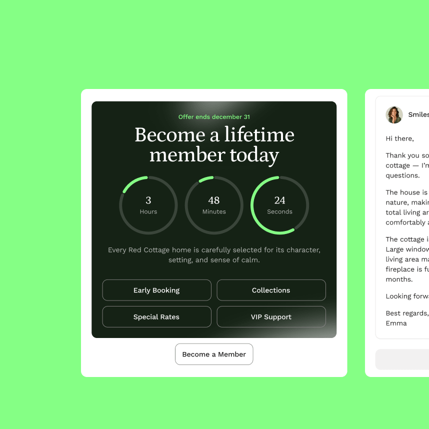
Email Design System

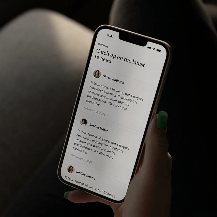
We designed a modular email system built for scale. Every template follows a consistent visual language while giving the marketing team flexibility to run seasonal campaigns, booking confirmations, and guest communications without needing a designer for every send.

Results

Red Cottage went from a brand without a defined visual identity to one that stands out in the most competitive channel in hospitality – the inbox. The team now has a documented brand system and a library of email templates they own and operate without external dependencies.
[woocommerce_my_account]